WAGNER'S BIRD SEED
STUDENT WORK | LOGO/BRANDING/PACKAGING
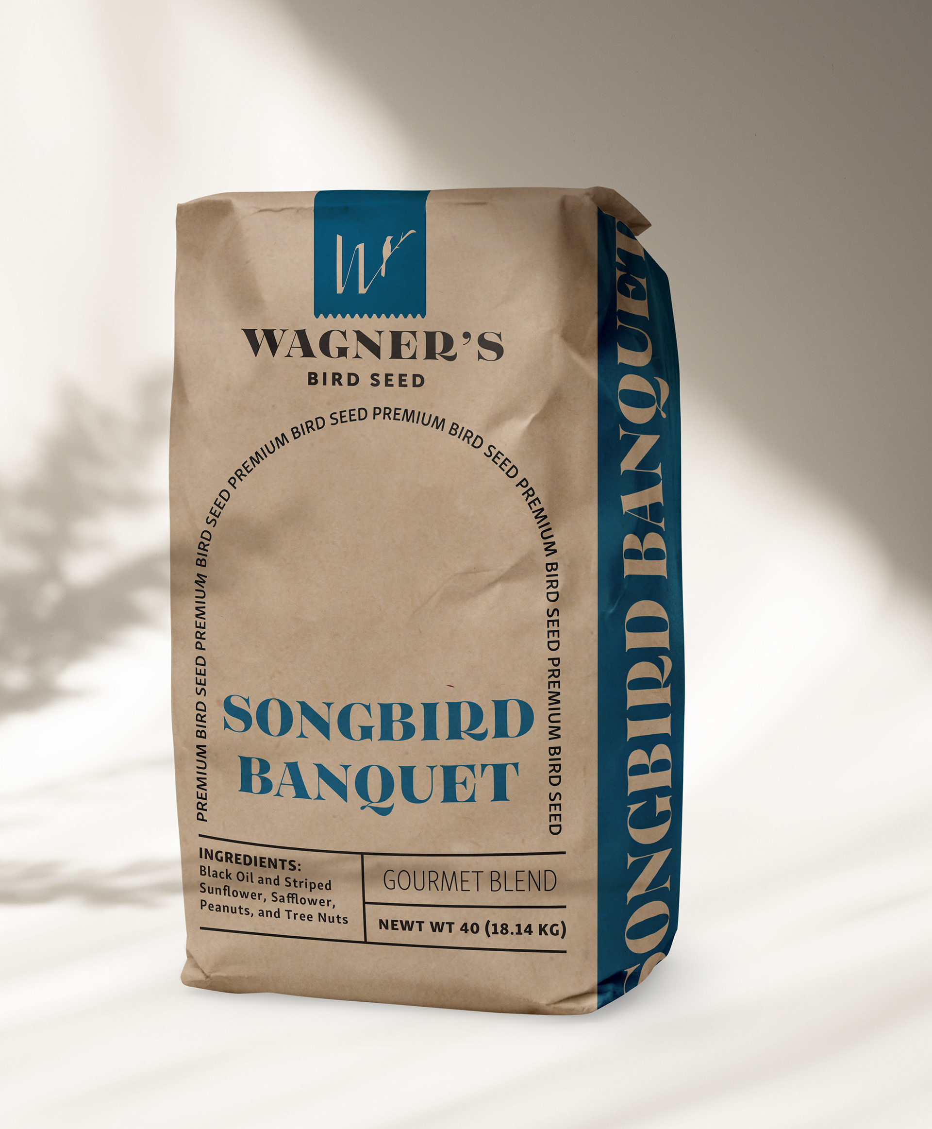
Wagner’s is a company with a deep history, a dedicated audience, and a long standing reputation as industry leaders. Having been founded in 1894 their packaging and branding were in dire need of an update. With such a large reputation and rich background, I took this as an opportunity to elevate the brand and tackle a new more economical market. I also used my brand extension to further support their current audience with a larger feed bag, and opened the market to new customers with a chic bird watching journal.
PROCESS | THE LOGO
By choosing a letter mark with high contrast I was able to channel the company's prominence and target a new audience. Using the logo on the bag keeps the product aligned with the client even when it is being repurposed.
PROCESS | THE BAG
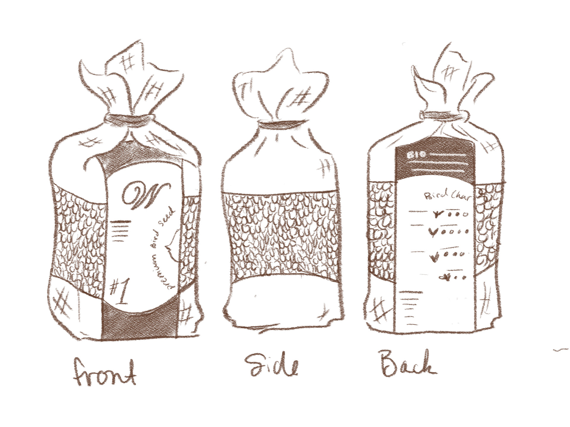
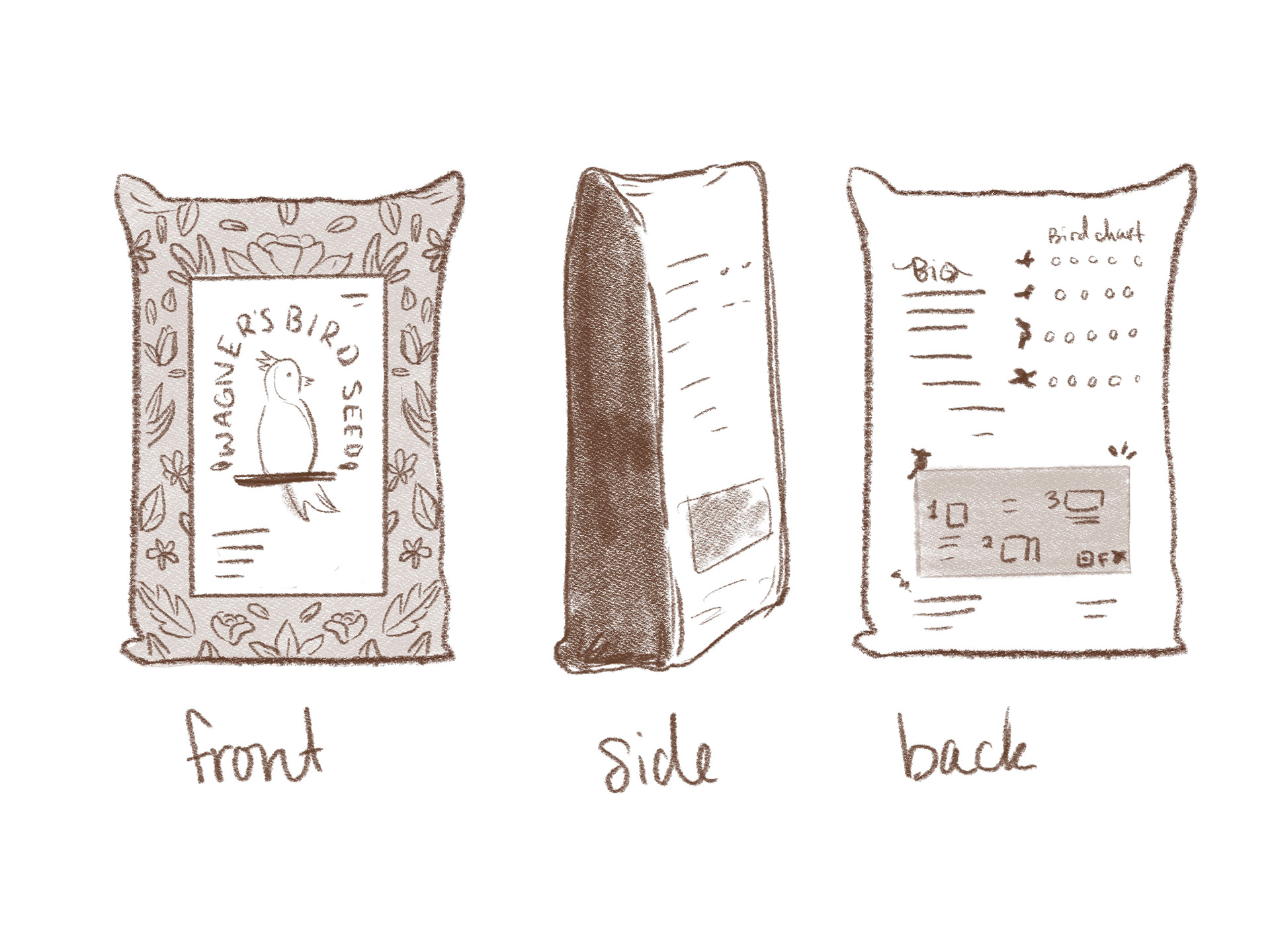
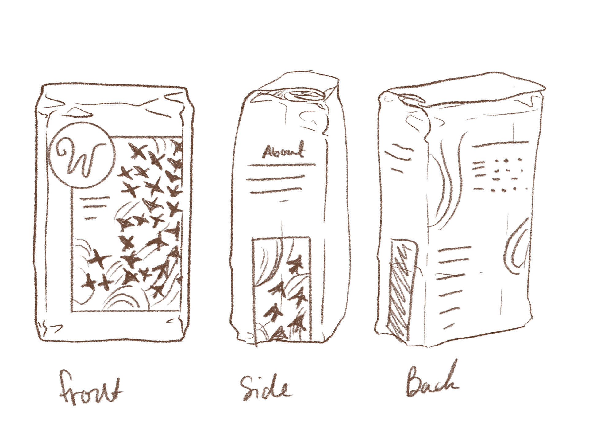
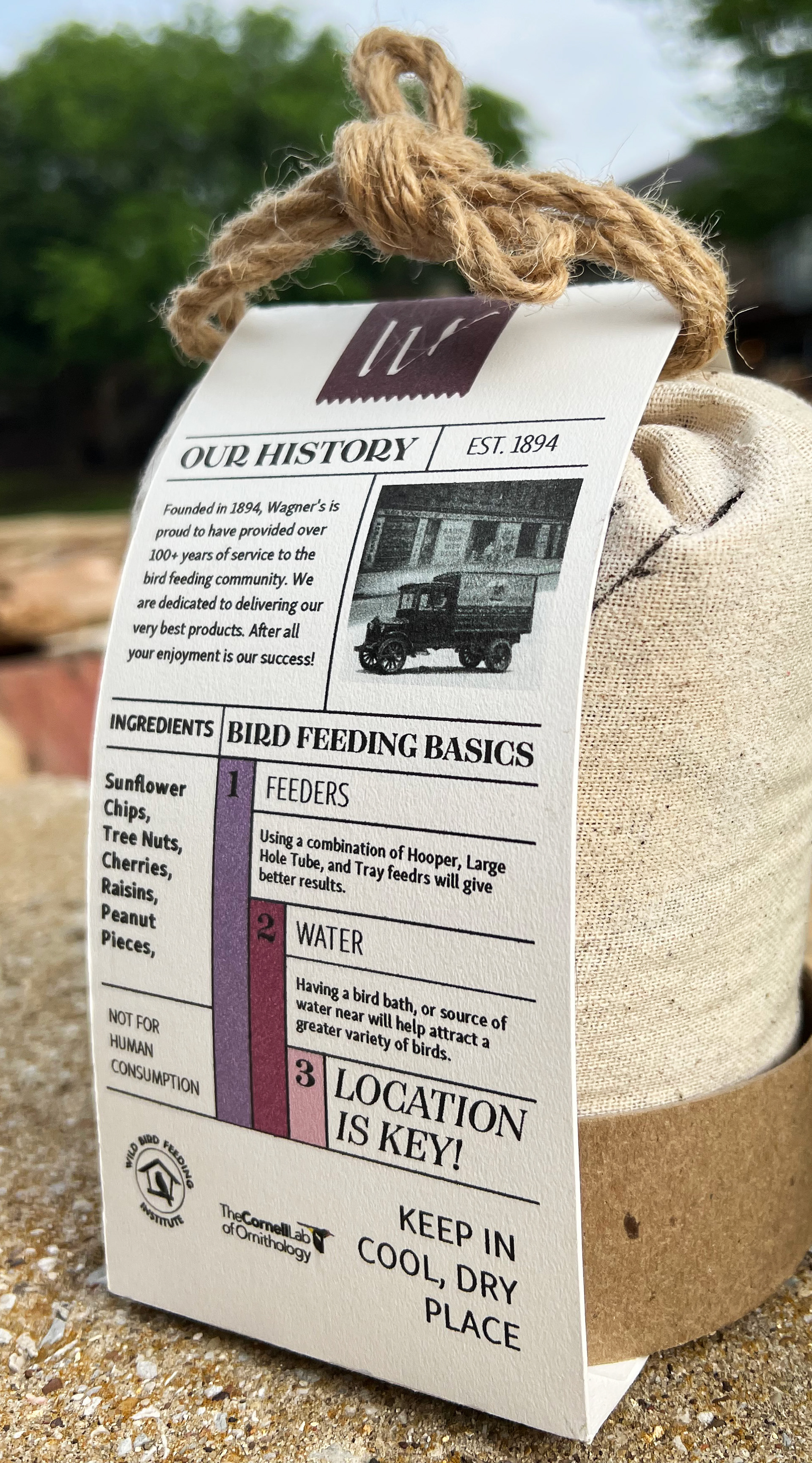
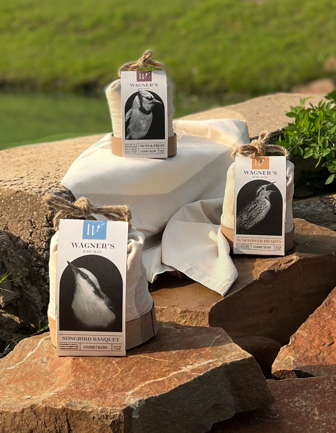
I chose a smaller 5lb bag to give first time buyers/hobbyst the option to sample different seeds, as well as help those who may be physically limited. It was important that the material be reusable and resealable.
PROCESS | THE LABEL
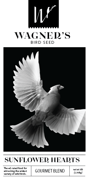
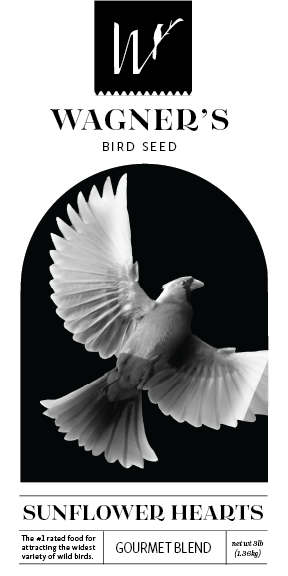
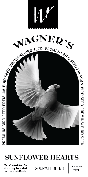
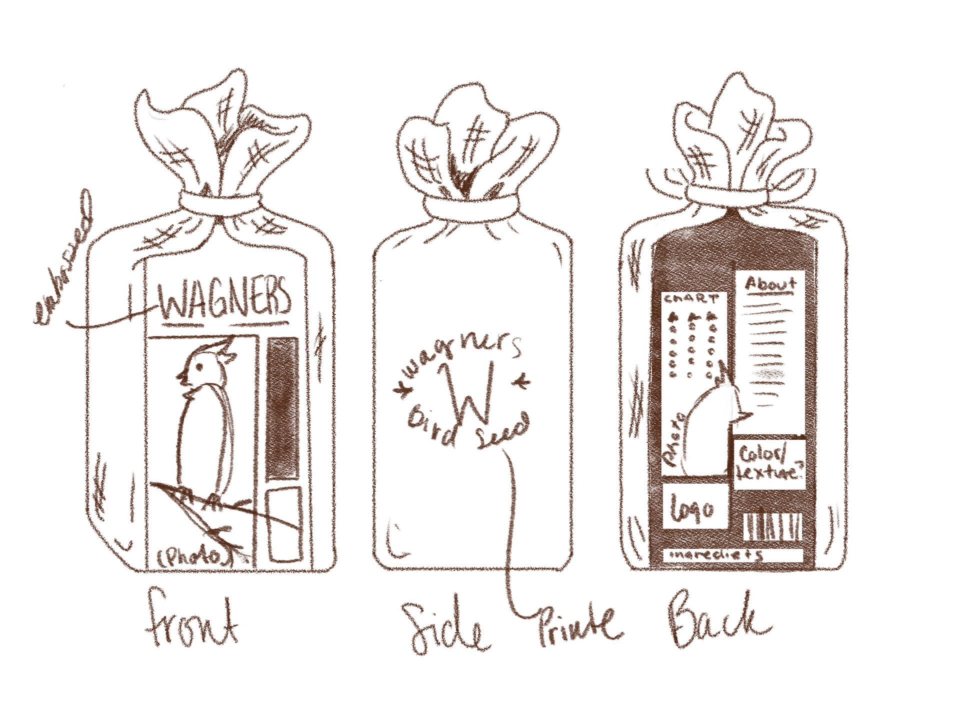
With the label I chose an editorial look using black and white photography to establish the product as higher quality.
